Hello fellow graphic designers- business owners- graphic designer business owners. This post is for you: the curious, information seeking, internet traveler. Perhaps you’re on a quest to understand how to graphically represent your company. Or trying to understand how to properly design for someone else. I know what you’re thinking, “Is this blog going to show me anything new?” I’m not listing “Top Ten Ways to Use Pink” or “How to Tips and Tricks! Tricky Things to be a Trickster” No, this is a story about me doing something I love (graphic logo design) – a goal that you someday would also like to achieve, if you haven’t already.
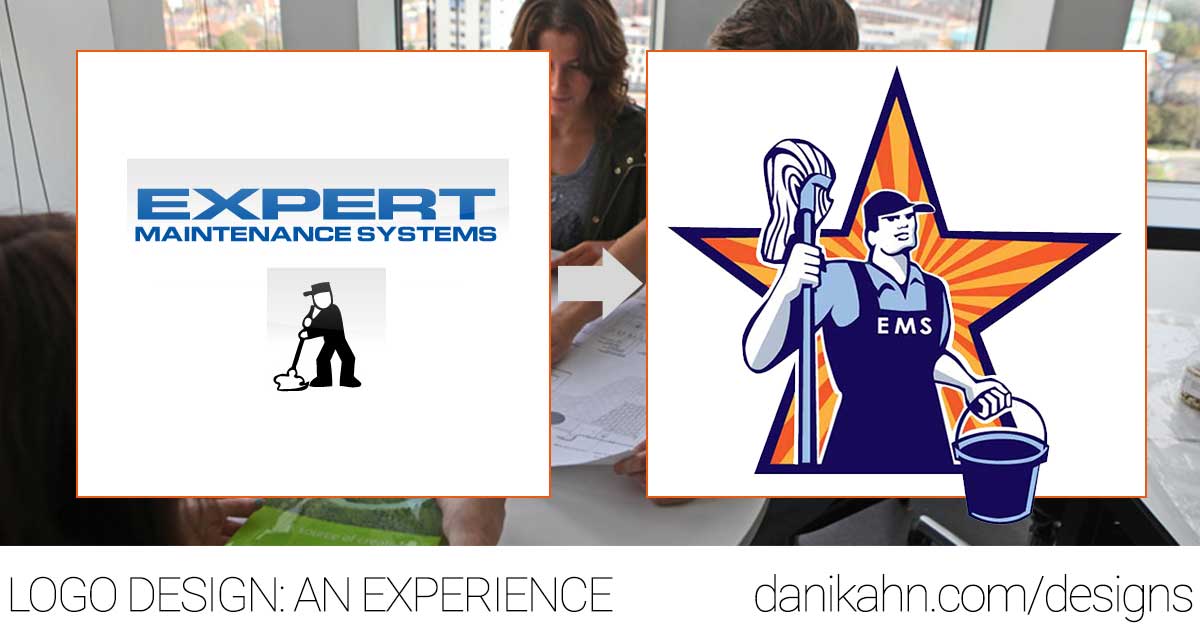
Grand opportunity came knocking when a company and it’s co-owner asked me to help redesign their logo! Expert Maintenance Systems. The company has been run for 25 years in the Mesa area by the most adorable husband and wife duo. When she asked me to help her redesign I was honored.
Listening
A huge part of design is communication. You, as a designer, understand shapes – symbols – composition – colors and then how to utilize them to create a message. You, as a business owner, have that message formulated in your mind – it might be just a concept – and you have the means to embody that. On both sides it’s important to understand what is necessary for both ends to achieve their goals.
EMS had a need. The desire was to make this…
…More recognizable to their clients and potential customers.
What does this company do exactly? Have I seen this logo before? Experts at what?
These questions are important and should be taken into consideration when you’re thinking about a logo. Now it was staring at us in the face. It was apparent how unspecific the text logo was. We needed a major overhaul to transform that.
Creative Bloq‘s post Expert Design Tips, #8. Immerse Yourself in the Brand. Here’s another great resource if you’re looking to design a logo (I like their infographic). I had to understand what this company was all about – luckily I had known Karen for a couple years now – so that was the easy part.
Ask Many Questions:
- What are the company values?
- Do you know any competitors logos you like?
- What are your favorite colors?
- What do you want the logo to portray?
- Etc…
- If you need a list of more questions to ask check out this 65 TIPS blog post by Creative Bloq
At first, we fixated on the word Expert because the company is really good at what they do (Cleans large commercial buildings, “Doing Common Things Uncommonly Well”). Everyone who sees the logo should know that. What were things that symbolize Expert?

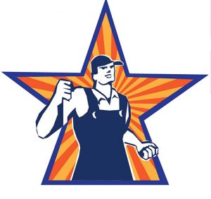
Here are my first round of sketches. I was getting a feel for what style/symbolism Karen would like- if she wanted to go more whimsical, or more stoic. We found later that I couldn’t have been more off the mark (which is okay). We did a round of sketches with laurels, determining those mean ‘expert’ or ‘royal’.
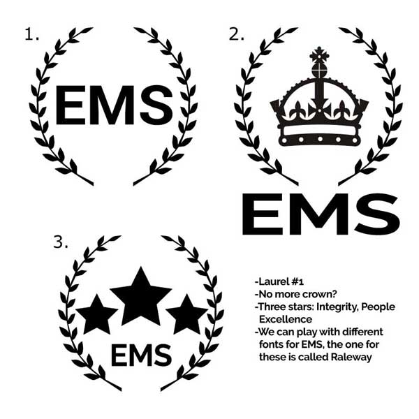
Then we decided that laurels were too royal…too aristocratic looking.
After a month of digesting information and thinking… An artist would normally call this ‘Artists Block’. I don’t believe in those, however.
This image popped into my view while driving on the highway…
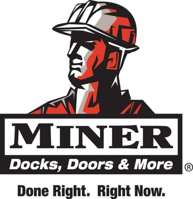
That guy sure looked like an expert.
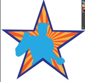
Simultaneously, Karen had been looking at stock images- here are our meeting notes from one of our brainstorm sessions.

You’ll see that guy in the upper left corner looks very similar to the complete project.
Art is Imitation
This is a touchy subject for some creatives. I am a stern believer that if The Sistine Chapel ceiling wasn’t painted by Michelangelo between 1508 and 1512, Salvador Dali wouldn’t have existed in art history (or at least to the capacity that he is known).
For comparison: check out this amazing collection of Michelangelo Buonarroti pieces here.
Then look at some of the stylistic choices of Salvador Dali.
I know this isn’t the Sistine chapel, this is graphic logo design. However I can proudly state that without inspiration from other places I wouldn’t be where I am today. The imagery we decided to go with is from a stock image.
Stock images (stock photography, designs) are professional images of common places, landmarks, nature, events or people that are bought and sold on a royalty-free basis and can be used and reused for commercial design purposes.
Adding specific colors and details I drew the logo using Adobe Illustrator CC 2017 (Which is a fantastic tool, fyi, with the new monthly deals they have with the Creative Cloud it’s AFFORDABLE. Whaat?)
This video is really exciting, I know. Look at those Node Adjustments. Does sarcasm come through my writing clear enough? I hope so. Goodness- we’re really not on the same page it that’s the case.
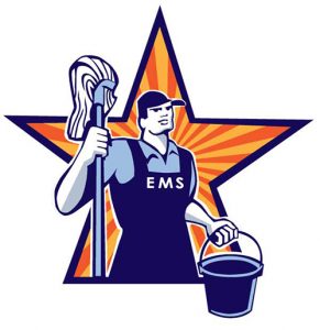
Completion
Here it is! I enjoyed working out the details of his overalls and the mop (gave it some artistic dimension).
Now, I might have made this process look/sound easy.
Just in case you might be confused, click here for a whole gallery of all my sketches from this job.
The where many additions, experiments, and color changes. We even completely flipped our original thought process, going with our EMS super hero man. This is part of the creative process and should not be discouraging. Continually asking questions through the process is a crucial step. Did she like the star? No? Do something to change it. Add a swoopy hair style? Maybe? No the hat is what gives it that Janitorial/Workman look.
Keep in Mind, This is the Company’s Logo
Designers, sometimes, have a pride issue- where they become fixated on cost or time. The idealistic ones may even think a concept is superior to the one chosen. Keep in mind: That’s not why you’re designing for someone. You have the capacity to create a piece of work- do it. You can have input and say, “No, we probably shouldn’t put neon green next to highlighter pink- here’s why (show them a study of how the human eye goes cross eyed when looking at those colors next to each other).